Welcome back to my blog. The title should tell you every thing. I'm feeling a bit stupid because I've made a huge mistake. Let me give you some context. Last year, for our final project, my group and I split filming between spring break and afterward. This year I assumed the same schedule and deadlines would apply. I was so wrong! My entire project hinged on my spring break plans. I didn't even bother to check the due date. I know what you are going to say "What were you thinking?" Trust me, I've been asking myself the same question. Now, I'm forced to fall back on my backup plan, which isn't exactly what I had in mind, but I will make it work. It's back to the planning and storyboard for me. On the bright side, I did manage to start filming my opening scene, so it's not a complete disaster. I can't help but feel frustrated with myself for this oversight. It's a lesson learned the hard way. I'll definitely be more observant in check...
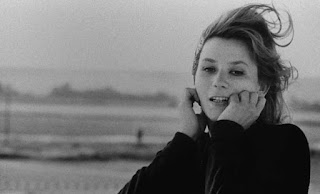
Video- My takeaway from the 12 Mokey’s Le Jetee video is that a feature film can be a remake or a remodel of a previous film The new version of the story can improve on the original or can fail in the attempt. I also learned that plot, use of sound and editing are important to making a film. I can see this helping with my short film process because in the short film they used still pictures instead of actual video and the sound they used still conveys their message without needed motions. An example of this when tensions rise, the viewer can hear a drum beat to symbolize the heart racing. The feature film does allow the audience to have editor to use different camera angles in order to get their point across. The short film editor is limited because he only uses pictures but has still found a way to use shot orientation to show “movement” or action. Article- This article reinforces the ideas from the video that show how a previous film’s plot and some basic elements can be copi...
Comments
Post a Comment